 The first volume (reviewed here) in the At the Mountains of Madness artbook collection concluded just as the cranking tension of the narrative rollercoaster reached the peak and things were going to kick off. Whilst it was the perfect moment for a cliff-hanger, it did mean that readers were waiting a year to see how the story.
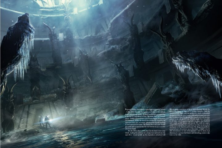
Francois Baranger continues his epic artwork rendering Lovecraft’s 1936 tale. Baranger perfectly captures the windswept grandeur of the arctic wilderness, often putting the scale of landscape into perspective through small human elements. This reinforces the vastness of the environment as well as underscoring how brutal it is to humans.
These moments are used incredibly effectively when the research team explore the ruins, as insignificant figures are held in stark contrast to the colossal buildings they have discovered. As well as the conveying their size, this conveys the understanding that these could never have been built by humans: they are just so alien.
Colour is also used effectively as well. Warmer colours like reds and browns, are sparingly used to convey the human elements, whilst cooler colours, like whites and blues, dominate the artic wilderness. Likewise, light and shadows are used to draw the eye, whilst darker colours are used to indicate dangers. The artwork becomes increasingly darker as the story progresses, reflecting the encroaching danger the explorers face.
One of the greatest challenges of an artbook about Lovecraft’s fiction is that the horrors are rarely described. Readers are offered small details, but never given a full description of them, other than “indescribable” (thanks Lovecraft…). However, Baranger conveys the indescribable nature of Lovecraft’s elder gods by obfuscating their details through smoke and the like.
Readers only see glimpses of these alien horrors, probably far more than we do in Lovecraft’s original text, but their full visage is never revealed. Thus, the reader’s sanity is preserved.
This artbook uses H.P. Lovecraft’s original text of At the Mountains of Madness for historical accuracy, including elements of Lovecraft’s unacceptable tendencies. Remaining aware of this will allow readers to appreciate his writing whilst recognising just how offensive some of his views were.
One thing to note: this artbook is huge, coming in at least A3 in size. It is certainly not something that could be read in the bath. However, the book needs to be this size in order for the artwork to be fully appreciated. To be any smaller would have lost some of the details in the paintings and diminished their sense of scale, which is so important for this tale.
There could be an argument for releasing the artwork in single volume. However, given the amount of time and effort required to paint all of the artwork contained in both books, splitting the story into two separate volumes reduces our waiting time.